Difference between revisions of "OtfPropertiesWindow"
(Created page with "{{DISPLAYTITLE:Open Test Framework - Properties Window}}Category:OTF The Properties window (or Property Grid) help users view and modify the properties of activities at d...") |
|||
| Line 1: | Line 1: | ||
{{DISPLAYTITLE:Open Test Framework - Properties Window}}[[Category:OTF]] | {{DISPLAYTITLE:Open Test Framework - Properties Window}}[[Category:OTF]] | ||
| − | The Properties | + | ==Overview== |
| + | The '''Properties Window''' (or Property Grid) help users view and modify the properties of activities at design-time. It contains all the necessary properties for the setting information of an activity. All the property entries are validated, see the [[design-time validation]]. Depending on the types of properties, the different types of controls are displayed, e.g. combo-boxes, drop-down lists, or buttons linking to specific editors with lists of items, etc. The read-only properties will be displayed in gray color (e.g. open the property grid of an activity in a referenced Ptx library). | ||
| − | + | {{ImageStyleCenter|PropertyGridDialog.png|850|Properties window for setting the properties of activities at design time}} | |
| − | + | The property grid can be displayed in the 2 different forms as follows: | |
| − | + | * Property Grid in the dialog box | |
| + | * Property Grid in the tool window | ||
| + | Whether you like to edit the properties of an activity with the tool window or with the dialog box is the matter of taste. You can select the respective option via the "'''Properties in the tool window'''" button in the [[OtfMenuBar|Ribbon]], see the image below. | ||
| − | + | {{Note| You can only use one of the property grid above at a time (i.e. if you open the property grid in the tool window, you can not open the property grid in the dialog box by double-click on the activity).}} | |
| − | + | ==Property Grid in the dialog box:== | |
| + | The property grid in the dialog box will be opened by double-clicking on an activity in the designer. The dialog box is displayed as in the image above. Dependending on the particular type of each property, it is displayed as a corresponding control: | ||
| − | + | * '''Text box''' | |
| + | : A text box allows you to input a value directly (e.g. the "Name" property is displayed as a text box). | ||
| − | + | * '''Combo-box''' | |
| + | : A combox-box has a edit box and a list of items, you can input a value directly in a combo-box or select a menu item in the list (e.g. the "Condition" property of the "Branch" activity is displayed as a combo-box). In the combo-box, all of the visible variables in the context with the corresponding types are displayed in the list of the combo-box to select. There are also some supported menu items in the list of the combo-box as shown below: | ||
| + | ::- The '''<Condition Editor...>''' menu item allows you to open a supported editor to create a compound boolean expressions. | ||
| + | ::- The '''<Expression...>''' menu item allows you to open the expression editor to create a complex expression. | ||
| + | ::- The '''<Create New Variable...>''' menu item allows you to create a new local variable with the corresponding type of the current property type. | ||
| − | + | {{Note| Not all the properties have all the menu items above e.g. the property "Result" only has the '''<Create New Variable...>''' menu item.}} | |
| − | + | * '''Drop-down List''' | |
| + | : A drop-down list is almost the same as the combo-box, except that you can not input a value directly in the drop-down list (e.g. the "ValidFor" property is displayed as a drop-down list). | ||
| − | + | * '''Editor''' | |
| + | : If an extra editor is available, there will be the "'''...'''" button on the right of the property. Click on the button and the editor will be opened as a new dialog box. This editor usually has a list of items which can be edited by adding, modifying and removing items, this a collection editor (e.g. the "Terms" property of the "LogicAnd" activity). In the special case, the property grid of the ExecuteDiagService activity has a different extra editor for setting the request/response parameters. | ||
| − | + | ==Property Grid in the tool window== | |
| − | + | The property grid in the tool window is essentially the same as the properties dialog box described above, except that this property grid is a tool window (ussually located at the bottom right of the OTF). When you select an activity in the designer, all the properties of the activity is listed in this tool window. Whether you like to edit the properties with the tool window or with the dialog box as previously described is the matter of taste. You can select the respective option via the "'''Properties in the tool window'''" button in the [[OtfMenuBar|Ribbon]], see the image below. | |
| − | Properties window as a | + | |
| + | Tips: If you uses the property grid in the tool window, you can double-click on an activity with the unassigned '''Result''' property to create a new local variable for the '''Result''' property. | ||
| + | |||
| + | {{ImageStyleCenter|PropertyGridToolWindow.png|1000|Properties window as a dockable tool window}} | ||
Revision as of 11:01, 11 August 2014
Overview
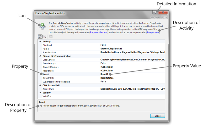
The Properties Window (or Property Grid) help users view and modify the properties of activities at design-time. It contains all the necessary properties for the setting information of an activity. All the property entries are validated, see the design-time validation. Depending on the types of properties, the different types of controls are displayed, e.g. combo-boxes, drop-down lists, or buttons linking to specific editors with lists of items, etc. The read-only properties will be displayed in gray color (e.g. open the property grid of an activity in a referenced Ptx library).

|
| Properties window for setting the properties of activities at design time |
The property grid can be displayed in the 2 different forms as follows:
- Property Grid in the dialog box
- Property Grid in the tool window
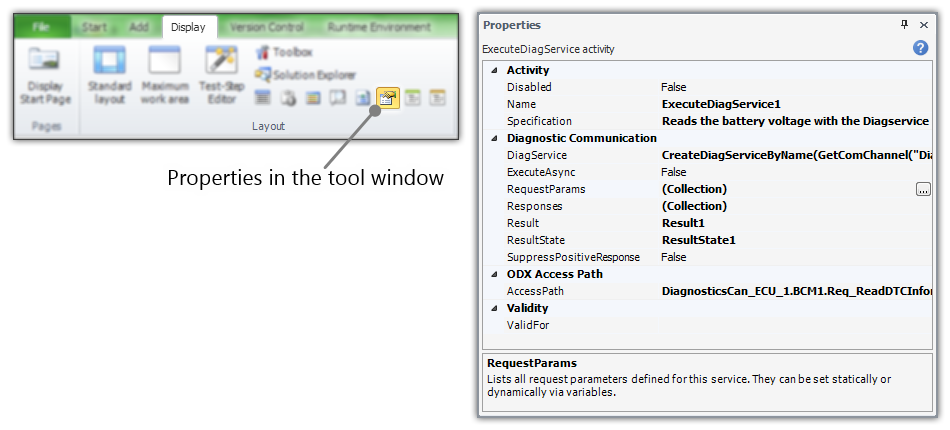
Whether you like to edit the properties of an activity with the tool window or with the dialog box is the matter of taste. You can select the respective option via the "Properties in the tool window" button in the Ribbon, see the image below.
Property Grid in the dialog box:
The property grid in the dialog box will be opened by double-clicking on an activity in the designer. The dialog box is displayed as in the image above. Dependending on the particular type of each property, it is displayed as a corresponding control:
- Text box
- A text box allows you to input a value directly (e.g. the "Name" property is displayed as a text box).
- Combo-box
- A combox-box has a edit box and a list of items, you can input a value directly in a combo-box or select a menu item in the list (e.g. the "Condition" property of the "Branch" activity is displayed as a combo-box). In the combo-box, all of the visible variables in the context with the corresponding types are displayed in the list of the combo-box to select. There are also some supported menu items in the list of the combo-box as shown below:
- - The <Condition Editor...> menu item allows you to open a supported editor to create a compound boolean expressions.
- - The <Expression...> menu item allows you to open the expression editor to create a complex expression.
- - The <Create New Variable...> menu item allows you to create a new local variable with the corresponding type of the current property type.

Not all the properties have all the menu items above e.g. the property "Result" only has the <Create New Variable...> menu item.
- Drop-down List
- A drop-down list is almost the same as the combo-box, except that you can not input a value directly in the drop-down list (e.g. the "ValidFor" property is displayed as a drop-down list).
- Editor
- If an extra editor is available, there will be the "..." button on the right of the property. Click on the button and the editor will be opened as a new dialog box. This editor usually has a list of items which can be edited by adding, modifying and removing items, this a collection editor (e.g. the "Terms" property of the "LogicAnd" activity). In the special case, the property grid of the ExecuteDiagService activity has a different extra editor for setting the request/response parameters.
Property Grid in the tool window
The property grid in the tool window is essentially the same as the properties dialog box described above, except that this property grid is a tool window (ussually located at the bottom right of the OTF). When you select an activity in the designer, all the properties of the activity is listed in this tool window. Whether you like to edit the properties with the tool window or with the dialog box as previously described is the matter of taste. You can select the respective option via the "Properties in the tool window" button in the Ribbon, see the image below.
Tips: If you uses the property grid in the tool window, you can double-click on an activity with the unassigned Result property to create a new local variable for the Result property.

|
| Properties window as a dockable tool window |